When I started thinking about writing a post about web font loading my intention was to propose relatively sophisticated ideas that I've been playing with for a while. However, as I was trying to use them in real-world websites I realized that deployment of the more advanced techniques is de-facto impossible without the creation of new web standards.
With that the TL;dr of this post is: Use font-display: optional. However, I and many others really like our custom fonts. See the rest of the post for how we can get our cake and eat it, too–with a tool that automatically makes fallback fonts behave like their respective custom font counterpart.
Web fonts and Core Web Vitals #
2 metrics in Google's Core Web Vitals are directly impacted by font loading:
- Largest Contentful Paint (LCP) measures (among other things) when text renders. With text rendering blocked behind the web font download, LCP may be delayed.
- Cumulative Layout Shift (CLS) measures the document shifting around as the browser loads additional data. A browser switching from fallback font to a custom font leads to layout shift if fallback and custom font flow differently.
The following video is showing the layout-shift created by font-loading.
CLS and invisible text #
Font-based layout shift doesn't require the fallback font ever having displayed. If the page renders without the custom font having loaded but the fallback text remains invisible (this happens with font-display: auto, the default) then the space that is reserved for the invisible text depends on the space that would be taken up by the fallback text. Once the custom font comes in and the text becomes visible, there is a layout shift as the space taken up for text changes.
Stop worrying and use font-display: optional #
With font-display: optional the browser only renders the custom font if it is available extremely quickly. In most scenarios that requires it being cached locally.
This leads to the best possible LCP: Your text always renders quickly, independent of network speed.
And it leads to the best possible CLS: Your custom font loading never causes layout shift because it is only used when it is available for the first text paint.
When not to use font-display: optional #
The one reason that makes usage of font-display: optional impossible is if there is no viable fallback font: You need the custom font to load to make sense of the content. Generally that is the case for icon fonts. You probably shouldn't use these in the first place as they are bad for accessibility: You need to see the icons to comprehend them, and you cannot assign them alt-text.
Using preload with font-display: optional #
Browsers will only download a font for a web page when CSS evaluation completes and it is determined that it is actually used on the page. That is much later than e.g. when image downloads are initiated which are done by the so-called pre-parser that does a quick scan of the HTML document as soon as it is available to the browser (and without blocking on synchronous scripts, stylesheets, etc.).
The common work-around is to use a link-preload element like this which explicitly instructs the browser to start the font download as soon as it discovers the element.
<link
  rel="preload"
  href="/fonts/Inter-Bold.woff2"
  as="font"
  type="font/woff2"
  crossorigin
/>
The question is: Should you use these together with font-display: optional? The conventional wisdom is: No. The reason being that with font-display: optional either your font is already in cache in which case this doesn't do anything, or the font download is likely not fast enough to make the short deadline and the browser would render the fallback font anyway. In the latter case you give bandwidth at the most urgent time to the font which will never render and that bandwidth could be used to download other critical resources instead.
When disk caching isn't enough #
However, with font-display: optional even users who have the font cached to disk might see the fallback font for the first page view of a new session because the custom font hasn't been loaded into the memory cache (Note, that while you might be developing your website on a laptop or phone with a very fast SSD, many of your users will have degraded storage devices with cache performance worse than a fast network). At least Chrome has a heuristic that if you preload the font, then it will hold painting for a few 100 of milliseconds and give the client a chance to fetch the font from disk or through a very fast internet connection. Whether you have a "budget" to spend those extra 100s milliseconds depends on your overall load performance.
Fonts and CDNs #
One of the big changes in the web ecosystem over the last few years is that browsers no longer cache resources across top level sites. That means if your site and my site both load the exact same Roboto from Google Fonts, the browser will download it twice as opposed to only once like they used to do. This is very sad. It is, however, also the right call in the short-term from a privacy & security perspective. In the long-term, maybe we can define web standards that eliminate the privacy & security threats from cross-origin caching for heavily shared resources like fonts.
So, what are the consequences of this change in browser caching behavior? The main change is that font CDNs like Google Fonts and Adobe TypeKit now strictly make your site slower. They used to help with cross-site caching, but that benefit is gone. Instead they add expensive cross-origin requests (and their DNS lookups, TLS negotiations, etc.) into the critical path of loading your website.
With that it is clear that we should self-host all fonts on our primary domain for maximum performance. With fonts this can sometimes be problematic for licensing reasons, etc. but there is a good middle ground: Instead of self-hosting the fonts, self-host the loading code. For all common Font CDNs (even TypeKit with some digging, they default to JS based loading) this is simply a CSS file. Just download that CSS file. It won't bite 😄. Or, if your font provider likes to sometimes change it, just fetch the CSS file once during your build process. Then inline the CSS file into your HTML and you completely eliminate the expensive cross-origin request from your critical path. While this approach still downloads the fonts themselves from the CDNs this doesn't hurt when you are using our friend font-display: optional.
What if I really don't want to use font-display: optional #
So, I have a solution for you. It works remarkably well. This is based on an idea/tool by Monica Dinculescu that she published in 2016. It allows tweaking your fallback font such that it uses approximately as much space as the custom font.
This is an awesome idea as it avoids the layout shift issues associated with loading the custom font: With the fallback already taking up the right amount of space, the custom font just swaps back into the same space when it loads.
Tool: Perfect-ish font fallbacks #
My contribution over Monica's idea is that I made a tool that automatically matches the fallback font to the custom font–because computers are good at that stuff. Try it out here.
The tool allows you to select every Google Font from a select menu. If you aren't using a Google Fonts, you can remix this Glitch for a custom solution.
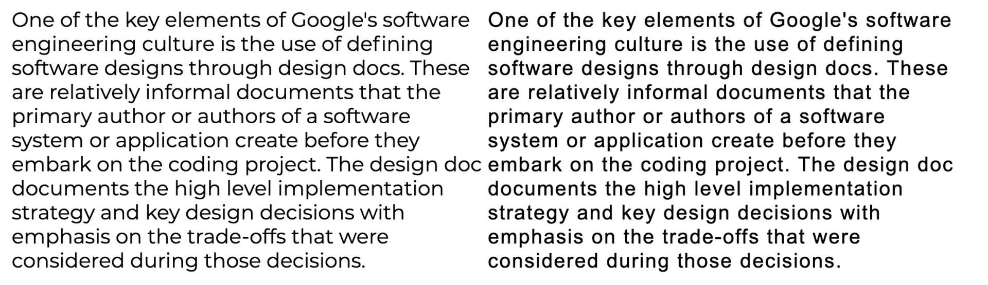
Samples #
The fallback-to-custom-font matching works really well in most cases. Here the left font is the custom font and on the right side is Arial:
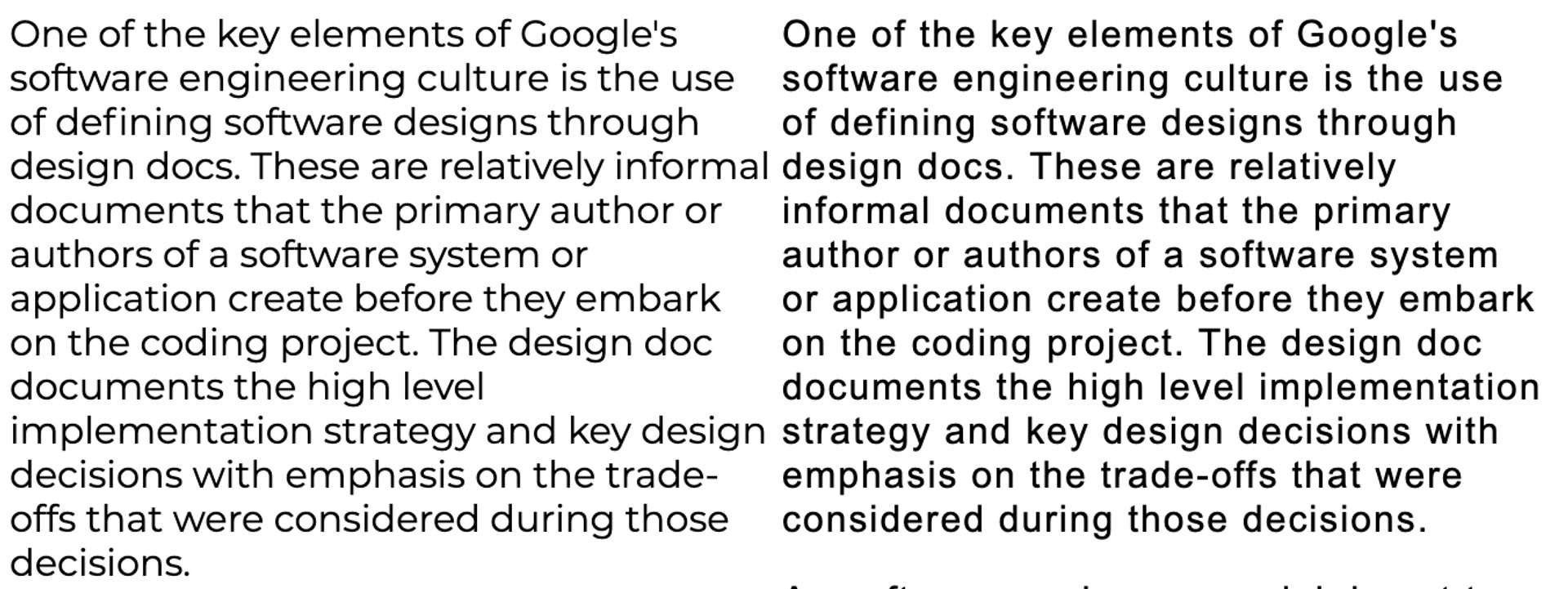
However, the whole thing is just an approximation. It definitely happens that things do not match 100%. (The screenshot shows the same text/font as before, but uses a different viewport width). The solution works most of the time. It isn't perfect but better than always having a major layout jump.
Finally, your mileage may vary with more extreme fonts. For very narrow fonts the fallback font may become unreadable. Having said that, for fonts that are commonly used this is not a problem.

Deploying fallback corrections to the website #
Just add CSS like this:
<style>
  /* Make a custom fallback font based on the local Times New Roman */
  @font-face {
    font-family: "CustomFont-fallback";
    size-adjust: 116.19%;
    src: local("Times New Roman");
  }

  /* Set the body to CustomFont, but if it is missing fallback
  to our bespoke fallback 'CustomFont-fallback'  */
  body {
    font-family: "CustomFont", "CustomFont-fallback";
    /* The value doesn't matter, but you must specify a line-height for all text with custom fonts to avoid CLS */
    line-height: 1.5em;
  }
</style>
…and that is it. This is possible as of July 2021
A new web standard #
With the @font-face property size-adjust a web standard solution is coming for the font-matching problem space. The tool in this article(requires Chrome 92+ or Firefox 92+) here has been updated to rely on size-adjust.
Note, that there are additional related CSS properties ascent-override and descent-override. However, you do not need to worry about these if you set a line-height of any non-default value for all text.
Summary #
Using font-display: optional together with self-hosting the CSS for your web fonts gets you in really good shape with respect to LCP and CLS. However, with new web standards support for size-adjust there is a feasible way to avoid CLS while still always eventually switching to the custom font.
Tools #
This is a list of known technologies and tools implementing all of these optimizations:
Published